1. Introduction
1.1 Understanding Six Sigma and the Importance of Quality Tools
Six Sigma is a data-driven methodology that aims to reduce variation, eliminate defects, and improve process efficiency across manufacturing, services, and knowledge-based industries. At its core, Six Sigma is built on the principle that every process has inherent variability, and this variability directly affects outcomes such as customer satisfaction, cost efficiency, reliability, and productivity. The methodology provides a structured approach—typically using the DMAIC framework—to solve problems using statistical analysis and evidence-based decision-making rather than intuition or guesswork. Because Six Sigma heavily relies on data accuracy and structured investigation, quality tools become essential for simplifying complexity, uncovering hidden patterns, and presenting insights in a visual and interpretable format. Tools such as Pareto charts, Fishbone diagrams, and Control charts equip teams with the ability to identify priorities, understand root causes, and monitor improvements with precision.
Without these tools, organizations risk making decisions based on assumptions, incomplete information, or anecdotal evidence. Quality tools bring discipline and clarity by turning raw data into meaningful visuals and actionable intelligence. They ensure that problems are solved systematically and that solutions are validated through measurable performance improvements. In essence, Six Sigma tools act as the backbone of continuous improvement initiatives, ensuring that teams can collaborate effectively, interpret process behavior accurately, and maintain control over key performance metrics in the long term.
1.2 Why Pareto Charts, Fishbone Diagrams, and Control Charts Matter
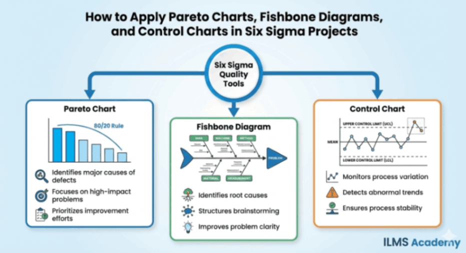
Pareto charts, Fishbone diagrams, and Control charts are among the most essential analytical tools used in Six Sigma because they help teams navigate the three fundamental stages of problem solving: prioritizing issues, identifying causes, and sustaining improvements. Each tool plays a distinct yet interconnected role. The Pareto chart helps teams focus on the “vital few” issues that contribute most significantly to defects, delays, or costs. Instead of dispersing effort across numerous minor problems, it directs attention to the small number of factors that create the greatest impact. The Fishbone diagram, on the other hand, drives a deeper understanding of root causes by organizing potential sources of problems into a logical framework. It fosters collaboration, encourages brainstorming, and prevents teams from prematurely jumping to solutions without thoroughly exploring all possible causal factors.
Control charts bring statistical rigor to monitoring process performance. After improvements are implemented, they help ensure that gains are not lost over time. By distinguishing between common cause and special cause variation, Control charts prevent organizations from overreacting to natural fluctuations while also alerting them when something unusual or undesirable occurs. Together, these three tools guide teams from initial problem identification to long-term process stability, making them indispensable to the Six Sigma toolkit. Their combined use ensures that solutions address the right problems, are rooted in accurate causes, and remain effective after implementation.
1.3 How These Tools Fit into DMAIC (Define, Measure, Analyze, Improve, Control)
The DMAIC framework is the core workflow of Six Sigma projects, and Pareto charts, Fishbone diagrams, and Control charts fit naturally within its sequential phases. During the Define and Measure phases, the primary goal is to understand the scope of the problem and collect baseline data. The Pareto chart plays a major role here by helping teams pinpoint the largest contributors to a process issue. It clarifies which categories, defects, or failure modes require immediate attention and ensures that the project targets high-impact areas instead of low-value symptoms.
The Analyze phase focuses on uncovering the root causes behind the identified issues. This is where the Fishbone diagram becomes essential. It supports systematic exploration of causes across categories such as materials, methods, people, equipment, environment, and measurement. When combined with the “5 Whys” technique and data validation, the Fishbone diagram ensures that the team isolates true root causes rather than superficial explanations.
Once improvements have been implemented, the Control phase ensures sustained success, and this is where Control charts are applied. They track real-time performance, measure variation, and determine whether the process remains stable under new operating conditions. Control charts help teams verify whether improvements are statistically significant and continue to produce desirable results.
Through each phase of the DMAIC cycle, these three tools connect logically and reinforce each other. They create a disciplined, repeatable structure that transforms raw data into targeted action and long-term reliability.
2. Overview of the Three Key Tools
2.1 What Is a Pareto Chart?
A Pareto chart is a visual analytical tool that combines bar graphs and a cumulative line graph to illustrate the relative importance of different categories of problems, defects, or causes. Built on the Pareto principle—often referred to as the 80/20 rule—it highlights the fact that a small number of causes usually account for a large proportion of issues in any system. The bars in the chart display the frequency or impact of each category, while the line graph helps viewers see how each category accumulates toward the overall total. Its primary purpose is prioritization: it identifies where attention and resources should be directed to achieve the greatest improvement with the least effort. By visually demonstrating the imbalance among contributors, the Pareto chart clarifies which problems must be tackled first to yield maximum results.
2.2 What Is a Fishbone Diagram?
A Fishbone diagram, also known as an Ishikawa or Cause-and-Effect diagram, is a structured visual tool used during root cause analysis to explore the various factors contributing to a particular problem or effect. The diagram resembles the skeleton of a fish, with a central “spine” pointing toward the problem statement. Branching out from the spine are major categories of potential causes, such as people, methods, materials, equipment, environment, and measurement. Each category contains sub-branches where the team lists more specific causes. This hierarchical structure helps teams break down complex issues, identify interdependencies among causes, and avoid superficial analysis. Its value lies in encouraging comprehensive brainstorming and ensuring that all possible sources of variation are examined before conclusions are drawn.
2.3 What Is a Control Chart?
A Control chart is a statistical tool used to monitor, control, and predict process performance over time. It plots data points on a graph in chronological order and includes three critical horizontal lines: the central line (representing the process average), and the upper and lower control limits (UCL and LCL), which represent the boundaries of expected process variation. These limits are calculated using statistical formulas rather than subjective judgment. The chart helps teams differentiate between normal, expected variation (common cause variation) and abnormal, unexpected variation (special cause variation). When data points remain within the control limits, the process is considered statistically controlled. However, patterns, trends, or points beyond the limits signal potential problems. A Control chart prevents over-reaction to natural fluctuations, supports fact-based decision-making, and serves as an essential tool for maintaining stable, predictable processes.
2.4 How the Three Tools Complement Each Other
Though each tool serves a unique purpose, their combined use strengthens Six Sigma problem-solving by creating a continuous chain of analysis, action, and validation. The Pareto chart identifies which issues deserve focus and helps teams avoid wasting effort on low-impact problems. Once priority issues are selected, the Fishbone diagram ensures that teams examine all possible causes in a structured and logical manner, promoting deeper insights and preventing premature solutions. After improvements are implemented based on verified root causes, Control charts help confirm that changes are effective and sustainable. This sequence—prioritize, analyze, and control—represents a cohesive flow that aligns perfectly with the DMAIC approach. When used together, these tools transform scattered data into focused, actionable, and lasting improvements.
PART I — APPLYING THE PARETO CHART
3. Understanding the Pareto Principle (80/20 Rule)
3.1 Historical Background
The Pareto principle traces its origins to the work of Italian economist Vilfredo Pareto, who observed in the late 19th century that approximately 80 percent of Italy’s land was owned by 20 percent of its population. His studies extended beyond land distribution and revealed that this disproportionate pattern appeared in various aspects of economics. Decades later, quality guru Joseph Juran adopted the concept and applied it to industrial quality control, coining the terms “vital few” and “trivial many.” Juran demonstrated that a small number of defect types typically account for the majority of problems in manufacturing and service processes. Since then, the principle has become a cornerstone of quality management, emphasizing the importance of focusing on the most impactful issues first. Today, the Pareto principle is widely used across industries to optimize resource allocation, prioritize customer complaints, identify key risk factors, and enhance organizational efficiency.
3.2 Why the Principle Works in Process Improvement
The Pareto principle works because most processes tend to be influenced by a limited set of dominant factors rather than an even distribution of causes. Variation is rarely spread uniformly; instead, it clusters around specific failure modes or operational weaknesses. In quality improvement, identifying these concentrated areas allows teams to generate rapid, meaningful results without addressing every possible problem. When teams concentrate on the vital few issues—those with the highest frequency or impact—they achieve a higher return on investment in terms of time, cost reduction, customer satisfaction, and operational efficiency. This targeted approach also prevents teams from diluting their efforts across non-critical issues. Furthermore, the principle aligns with human cognitive strengths by reducing complexity and making large datasets easier to analyze. By highlighting the causes that matter most, the Pareto chart transforms problem-solving into a systematic, focused process rather than a scattershot effort.
3.3 Common Misconceptions About 80/20
Despite its usefulness, the 80/20 rule is often misunderstood. One common misconception is that the ratio must always be exactly 80 percent to 20 percent. In reality, the ratio is symbolic rather than exact. The point is not the specific numbers but the imbalance they represent. Sometimes the split may be 70/30, 90/10, or even 60/40. What matters is that a small portion of categories typically accounts for a disproportionately large share of problems. Another misconception is that the Pareto principle applies only to manufacturing settings or defect analysis. In truth, it applies broadly across customer complaints, financial losses, equipment downtime, process inefficiencies, and even productivity and time management. Finally, some believe the Pareto chart replaces deeper analysis, but it serves only as the starting point. After identifying priority issues, teams must still perform root cause analysis using tools like Fishbone diagrams to uncover the reasons behind the patterns.
4. Components of a Pareto Chart
A Pareto chart is more than a simple bar graph; it is a structured analytical tool designed to highlight the disproportionate impact of different categories of problems. Its construction reflects the idea that not all issues are equal, and some exert far greater influence on defects, delays, or financial losses than others. To understand how to interpret or create a Pareto chart effectively, it is essential to examine each of its components in detail. These components—bars, cumulative line, categories, and the comparison between frequency and impact—work together to convert raw data into a visually intuitive prioritization model.
4.1 Bars
The bars form the foundation of the Pareto chart. Each bar represents a specific category of issues, such as a defect type, complaint reason, waste category, error source, or failure mode. The height of the bar corresponds to how often the issue occurs or how significant its impact is. These bars are always arranged in descending order from left to right. This design choice is deliberate, as it ensures that the most significant category is immediately visible on the left side of the chart, drawing attention to the critical few contributors that demand the most urgent corrective action.
The descending arrangement also reinforces the visual imbalance inherent in most processes: a few categories tower over the rest, highlighting the disparity in contribution. This statistical imbalance is central to the Pareto principle. Without arranging the bars in this order, the viewer would have to mentally scan for the highest bars, which diminishes clarity. By positioning the tallest bars first, the chart becomes an instant roadmap for prioritization. The bars display raw volume or magnitude, but their real value emerges when they are paired with the cumulative percentage line.
4.2 Cumulative Line
The cumulative line overlays the bar graph and provides the second analytical layer of the Pareto chart. It begins at the first bar and rises steadily as each additional bar’s value is added. Visually, it illustrates how each category contributes to the total when considered cumulatively. The shape of this line is often what clearly reveals the “vital few.” For example, if the cumulative line shows that the first three bars account for 78 percent of the total defects, this instantly signals where improvement efforts will yield the highest return.
The cumulative line transforms the chart from a simple histogram into a strategic decision-making tool. It allows the user to identify the cut-off point where the vital few end and the trivial many begin. But beyond that, it also allows the user to see whether the process follows a typical Pareto distribution or whether issues are more evenly distributed. In cases where the cumulative curve rises almost linearly, this may indicate a system with no single dominant cause, requiring more broad-based or systemic solutions. In contrast, a sharply rising cumulative line confirms that a small number of factors strongly influence performance. In this way, the cumulative line is integral to interpreting the magnitude of imbalance in the data.
4.3 Categories
Categories are the backbone of any Pareto analysis because they define what the bars represent. A category should be meaningful, distinct, and rooted in the purpose of the analysis. Poorly defined categories can mislead decision-makers, mask root causes, or produce a chart that appears balanced even when serious imbalances exist. The selection of categories must reflect real diagnostic needs. For example, if the purpose is to analyze defects in a production line, categories might include scratches, dents, misalignment, surface contamination, or missing components. If the aim is to analyze customer complaints, categories may reflect issues like delayed delivery, wrong items, payment errors, or packaging concerns.
Well-structured categories allow the Pareto chart to reveal meaningful patterns. Overlapping categories or overly broad labels dilute insight. If, for instance, “machine faults” is used as a category in manufacturing, but machine faults include several distinct failure types, such as lubrication issues, overheating, and calibration problems, then the category becomes too generic and may conceal the specific root cause. Conversely, overly granular categories may create needless clutter and make it harder to see the larger picture. Effective categorization strikes a balance, making the chart both informative and manageable. Categories must be based on accurate data gathering, consistent definitions, and a clear understanding of the process being analyzed.
4.4 Frequency vs. Impact
A Pareto chart can be constructed using two different metrics: the frequency of occurrences or the impact of occurrences. Understanding the difference is crucial because these metrics shape improvement strategy. Frequency-based Pareto charts simply count how many times each category occurs. They are useful when a process experiences numerous defects or errors and the goal is to identify which ones occur most often. For example, if a production line frequently produces scratched components, even if scratches are minor in severity, they may dominate the chart due to sheer volume.
Impact-based Pareto charts, on the other hand, are built using financial or operational impact rather than frequency alone. This approach is valuable when some issues occur rarely but carry a high cost. For instance, a packaging error may occur only a few times per month but may result in expensive returns or damaged customer relationships. In such cases, an impact-based chart may reveal a different priority order than a frequency-based chart. Organizations must decide which metric—frequency or impact—aligns best with their project goals. Sometimes, teams even construct both charts to compare patterns, ensuring that they do not overlook low-frequency but high-consequence problems. Understanding the distinction ensures a Pareto chart reflects genuine business priorities rather than superficial volume patterns.
5. When to Use a Pareto Chart in Six Sigma
Pareto charts are among the most widely used tools in Six Sigma projects because they clarify which problems deserve immediate attention. They are especially valuable when team members feel overwhelmed by a long list of issues or when an organization wants to optimize improvement efforts by focusing on what truly matters. In DMAIC projects, Pareto charts can be applied at multiple stages—including Define, Measure, and Analyze—whenever prioritization is necessary. Below are detailed explanations of the key contexts in which a Pareto chart becomes indispensable.
5.1 Defect Identification
In environments where defects are tracked regularly—whether in manufacturing, logistics, healthcare, or service delivery—the Pareto chart serves as an essential tool for isolating the most problematic defect types. Processes often produce a long list of defects, but not all defects occur with equal frequency. By plotting all defect categories and arranging them from the most to the least frequent, a Pareto chart pinpoints the small group of defects that cause the majority of quality failures. This helps teams avoid scattering their efforts across dozens of minor problems and instead concentrate resources where they will produce the greatest improvement.
Defect-based Pareto charts also provide evidence to justify resource allocation. Instead of relying on anecdotal feedback from employees or supervisors, the organization bases its decisions on structured data. Furthermore, once the highest-frequency defects are identified, teams can proceed to root cause analysis using tools such as the Fishbone diagram, Failure Modes and Effects Analysis (FMEA), or 5 Whys. The Pareto chart thus becomes the gateway to targeted problem-solving and prevents teams from making assumptions about which defects matter most.
5.2 Cost Analysis
In Six Sigma and Lean initiatives, cost reduction is often a major goal, and Pareto charts provide a reliable means of identifying cost-intensive problems. When used with cost data, the chart highlights which issues, defects, or failures impose the highest financial burden on the organization. This may include rework, scrap, downtime, warranty claims, service-level penalties, or customer compensation. A cost-based Pareto chart may reveal surprising insights. Some issues that occur infrequently may rank very high in cost due to their severity or the repercussions they trigger. Conversely, issues that occur frequently may not have a major financial impact.
By applying the Pareto chart to cost data, organizations avoid misallocation of improvement budgets and target the issues that deliver the most significant return on investment. In capital-intensive industries such as automotive manufacturing or pharmaceuticals, even minor improvements in high-cost defect categories can save millions. For service industries, cost-based Pareto charts can expose high-cost operational inefficiencies related to call handling, claims processing, billing errors, or service escalations. In short, cost-based Pareto charts ensure that financial impact, not just defect count, drives improvement strategy.L
5.3 Customer Complaints and VOC
Customer complaints represent a critical form of data for improving product quality and service experiences. However, these complaints often cover a wide range of issues, making it difficult to identify what frustrates customers the most. A Pareto chart organized around Voice of the Customer (VOC) categories helps structure this unorganized feedback into meaningful insights. For example, customers may voice concerns about late deliveries, incorrect items, billing issues, product defects, or unresponsive support teams. When these complaints are plotted on a Pareto chart, the organization can clearly see which issues are most prominent and, therefore, most damaging to customer satisfaction.
This approach allows companies to address customer pain points systematically rather than reactively. Instead of responding to isolated complaints based on urgency or the prominence of a particular customer, the organization bases its improvement efforts on aggregated data. By resolving the most common or most damaging complaint categories, companies can significantly improve customer loyalty, reduce churn, enhance brand reputation, and bolster long-term profitability. This makes Pareto charts an essential tool in customer experience (CX) and service quality initiatives.
5.4 Process Waste Analysis
In Lean Six Sigma, waste reduction is a central objective. Waste can appear in many forms, including overproduction, excess motion, unnecessary waiting, transportation delays, inventory buildup, defects, rework, or underutilization of talent. A Pareto chart brings clarity to these waste categories by quantifying how frequently each type occurs or how much cost or time each waste category contributes to total process inefficiency. For example, in a warehouse environment, unnecessary motion may occur frequently, while excess inventory may contribute more significantly to total cost. A Pareto chart helps distinguish these patterns.
Process waste analysis using a Pareto chart enables organizations to design improvement actions that directly target bottlenecks, inefficiencies, and forms of waste with the greatest operational impact. Rather than spreading improvement efforts thinly across multiple low-impact wastes, teams gain the ability to concentrate on the few categories that unlock the most significant productivity gains. Waste-focused Pareto analysis not only improves operational efficiency but also enhances flow, reduces lead times, and supports continuous improvement culture across the organization.
6. Step-by-Step Process: How to Create a Pareto Chart
Creating a Pareto chart is one of the most fundamental yet powerful analytical actions within the Measure and Analyze phases of Six Sigma. Although it appears visually simple, the quality of the chart is entirely dependent on the rigor and discipline applied during its creation. The true value of a Pareto chart lies not just in the final graphic but in the systematic approach taken to gather data, categorize it, visualize it correctly, and then interpret it with logical reasoning. Each step builds on the previous one, ensuring that the insights drawn from the chart are both statistically meaningful and operationally actionable.
6.1 Define the Problem
Every Pareto analysis must begin with a problem that is clearly and precisely articulated. A poorly defined problem leads to poorly focused data, which ultimately leads to inaccurate insights. Defining the problem involves specifying what issue is being analyzed, over what time period, and from which process or system the data will be extracted. For example, instead of stating “Reduce customer complaints,” a more specific definition would be “Analyze the types of customer billing complaints received in Q3 from the online subscription system.” The defined problem acts like a boundary line that determines what data belongs in the analysis and what should be excluded. At this stage, it is essential to confirm the problem definition with relevant stakeholders so the scope is aligned across operations, quality teams, and management.
6.2 Collect and Organize Data
After the problem is defined, the next step is gathering data that accurately reflects the issue under investigation. Data collection must be systematic, consistent, and free from bias. Many organizations struggle at this point because defects, complaints, or errors are often not recorded with adequate detail or consistency. Therefore, teams typically review historical logs, digital records, ERP systems, production sheets, complaint databases, help desk tickets, or manual registers depending on the process type. Once collected, the data needs to be organized into meaningful categories. For instance, if the problem relates to machine stoppages in manufacturing, categories may include “mechanical failure,” “material jam,” “operator error,” or “power fluctuation.” Categories should be mutually exclusive and collectively exhaustive so that each data point fits into only one category and no data is left out.
6.3 Prioritize Categories
Prioritization is the core logic behind Pareto analysis. After organizing data into categories, each category must be evaluated based on its frequency or impact. This evaluation typically involves counting how many times each category occurred during the period under review. Once tallied, the categories are arranged in descending order, from the highest frequency to the lowest. This step converts raw data into a prioritized list that clearly reveals which issues dominate the process. It is also the point at which cumulative percentages are calculated, as these will later determine the shape and meaning of the Pareto curve. At this stage, outliers or inconsistencies in data should also be reviewed to ensure the dataset is accurate and reliable before moving forward.
6.4 Construct the Chart
Once the data is ready and prioritized, constructing the chart becomes a straightforward task. The bars represent the categories and their frequencies, arranged from the most significant contributor on the left to the least significant on the right. A line graph overlays the bars to indicate the cumulative percentage, starting from zero on the first bar and rising to 100%. The left vertical axis typically shows the frequency of occurrences, while the right vertical axis displays cumulative percentages. The width of the bars should be uniform, and the gap between them minimal to maintain clarity. The chart should be properly labeled with a title, category names, axis descriptors, and a time frame. When correctly constructed, the Pareto chart visually guides stakeholders toward the top contributors, allowing the “vital few” categories to stand out instantly.
6.5 Interpret Results
The interpretation phase is where analytical thinking is essential. The Pareto chart visually highlights which categories contribute most to the overall problem, enabling the team to identify which areas deserve immediate attention and resources. Interpretation involves looking for steep rises in the cumulative line, as these indicate a small number of categories driving a large portion of the issue. Conversely, a gradual rise implies a more evenly distributed problem. Interpretation also requires examining whether frequency alone is the correct metric or whether severity or cost should also be considered for deeper insights. If a low-frequency category causes disproportionately high financial losses or safety hazards, the team may need to prioritize it despite its lower count.
6.6 Validate With Cross-Functional Teams
Before acting on Pareto results, cross-functional validation is crucial. Quality improvements affect multiple departments, and assumptions made by one team may not fully reflect the realities of others. Engaging with operators, supervisors, finance personnel, engineers, customer experience teams, or IT staff helps validate whether the prioritization aligns with operational experiences. This step ensures that decisions made from the Pareto chart are not only statistically valid but also practically relevant. Cross-functional review can also provide context around why certain categories appear more frequently and whether certain data points may have been miscategorized or influenced by seasonal or operational variations.
7. Deep Interpretation: What the Pareto Chart Reveals
A Pareto chart is more than a visual tool; it is an analytical lens that reveals deeply embedded patterns within business operations. The insights drawn from the chart often lead to strategic decisions on resource allocation, process redesign, training priorities, and customer satisfaction initiatives. Understanding these insights requires more than observing the tallest bar—it requires a comprehensive interpretation of trends, variations, relationships, and anomalies.
7.1 Identifying the “Vital Few”
The core contribution of the Pareto chart lies in separating the “vital few” contributors from the “trivial many.” The vital few categories are those that dominate the issue and typically represent the top 20% of causes contributing to around 80% of the outcomes. Once identified, these categories become primary targets for improvement. The vital few are not always obvious in raw data tables, which is why the visualization provided by the chart is so powerful. By highlighting the top contributors, the Pareto chart ensures that organizations avoid spreading resources too thinly across less significant areas, instead focusing on actions that will generate the maximum impact with minimum effort.
7.2 Distinguishing Between Frequency and Severity
A deep interpretation also reveals differences between issues that occur frequently and issues that have high severity despite lower occurrence rates. For example, a category with a high number of complaints may not necessarily be the most damaging in terms of cost, safety, or customer dissatisfaction. Conversely, a rare but severe issue—such as a critical system outage—may justify priority attention. This distinction prompts teams to decide whether a frequency-based Pareto, a cost-based Pareto, or a weighted Pareto is most appropriate for the problem at hand. Effective interpretation always considers context so that decision-making is more holistic and aligned with organizational priorities.
7.3 When the Curve Does Not Follow 80/20
Not all Pareto charts follow the classic 80/20 pattern. Sometimes the distribution is more balanced, indicating that the problem arises from multiple categories with similar frequency. In such cases, the Pareto chart still provides value by demonstrating that improvement efforts cannot be limited to a narrow set of categories. When no clear group of vital few emerges, it may indicate systemic process-wide issues rather than isolated causes. Additionally, a flatter curve may suggest variations in data collection, seasonal effects, inconsistent processes across shifts or locations, or incomplete categorization. Recognizing these deviations enables teams to refine their analytical approach and reexamine their categorization strategy.
7.4 Re-checking Data Validity
A sophisticated interpretation of a Pareto chart always involves questioning the underlying data. If the pattern appears unusual or inconsistent with operational knowledge, the team must verify data accuracy. This includes reviewing whether all relevant incidents were captured, whether categories were defined properly, and whether the timeframe selected was representative. Sometimes the Pareto chart exposes gaps in data collection rather than insights into the problem itself. In such instances, the chart becomes an opportunity to improve measurement systems through better documentation practices, standardized reporting methods, or automation.
8. Real-World Case Studies Using Pareto Charts
One of the strengths of the Pareto chart is its universal applicability across industries, processes, and organizational functions. Its logic is relevant whether the goal is to reduce defects, improve customer service, streamline software development, or minimize returns in retail. Real-world examples illustrate how the tool can be used to drive measurable improvements in quality, cost, and customer satisfaction.
8.1 Manufacturing: Defect Reduction
In the manufacturing industry, Pareto analysis is commonly used to identify the most frequent types of defects affecting product quality. For example, a company producing metal components may record defects such as scratches, incorrect dimensions, surface dents, machining errors, and coating failures. After collecting three months of defect data, the team constructs a Pareto chart and discovers that machining errors and coating failures account for nearly 70% of all defects. This insight leads the company to conduct a deeper root cause analysis on the machining and coating processes, ultimately adjusting machine calibration and improving operator training. As a result, overall defects reduce significantly within one production cycle.
8.2 Healthcare: Reducing Patient Complaints
Healthcare organizations use Pareto charts to improve patient experience by categorizing complaints related to appointment delays, billing confusion, medication errors, staff behavior, or facility cleanliness. In a hospital outpatient department, a Pareto analysis may reveal that appointment delays and billing issues are the most common complaints. By focusing improvement efforts on streamlining appointment scheduling and revising billing communication procedures, the hospital can reduce overall patient dissatisfaction substantially. The Pareto chart guides administrators toward the areas where improvements will have the greatest impact on patient trust and service quality.
8.3 Customer Service: Call Center Issues
Call centers often face recurring issues such as long wait times, improper call routing, inadequate agent knowledge, system downtime, or unclear scripts. A Pareto chart helps managers identify which issues are responsible for most customer escalations. For example, the analysis might show that almost half of escalations stem from agent knowledge gaps, prompting the company to enhance product training. Another significant contributor might be system downtime, leading to investments in infrastructure upgrades. These targeted actions allow the center to improve efficiency and customer satisfaction within a short period.
- Certificate Course in Labour Laws
- Certificate Course in Drafting of Pleadings
- Certificate Programme in Train The Trainer (TTT) PoSH
- Certificate course in Contract Drafting
- Certificate Course in HRM (Human Resource Management)
- Online Certificate course on RTI (English/हिंदी)
- Guide to setup Startup in India
- HR Analytics Certification Course
8.4 IT & Software: Bug Prioritization
In software development, teams are often inundated with bug reports that vary in severity and impact. Using a Pareto chart, they categorize bugs into types such as UI errors, API failures, database issues, login problems, or mobile responsiveness glitches. After analysis, they may find that API failures, although fewer in number, account for the majority of user complaints and system crashes. This insight shifts the team’s focus toward API stabilization instead of spending equal effort on low-impact UI issues. As a result, software reliability improves, and customer satisfaction increases.
8.5 Retail and E-commerce: Return Reasons
In e-commerce, returns significantly affect profitability. A Pareto analysis categorizing return reasons such as size mismatch, damaged items, incorrect delivery, poor quality, or color variation can reveal key issues. For instance, size mismatch may constitute 45% of all returns for an apparel retailer. This insight encourages the company to refine size charts, improve product descriptions, and offer virtual try-on tools. Similarly, if damaged items represent another major category, the retailer may upgrade packaging materials and handling procedures. Pareto-based insights enable companies to target the most costly issues first, improving customer satisfaction and reducing operational losses.
9. Introduction to Root Cause Analysis
The transition from Pareto charts to Fishbone diagrams in a Six Sigma project occurs naturally, as the Pareto chart identifies the problem categories while the Fishbone diagram uncovers the underlying causes. Root Cause Analysis (RCA) is a structured approach used to determine the fundamental reasons why a problem occurs. Without RCA, organizations risk implementing surface-level solutions that treat symptoms instead of addressing underlying issues. RCA ensures that corrective actions deliver sustainable, long-term improvements rather than temporary fixes.
9.1 Why Root Cause Analysis Matters
Root Cause Analysis is essential in Six Sigma because process defects or inefficiencies often have deeper origins than what is immediately visible. When teams act solely on the surface-level symptoms, the problem tends to return, sometimes in more severe forms. RCA provides a disciplined framework that encourages teams to investigate issues more deeply by analyzing process flow, human behavior, environmental factors, equipment limitations, and procedural inconsistencies. By identifying the true root cause, organizations can implement corrective actions that eliminate the problem entirely or significantly reduce its occurrence. RCA also strengthens a culture of continuous improvement by encouraging curiosity, data-driven reasoning, and collaborative evaluation.
9.2 Types of RCA Tools and Why Fishbone Is Unique
There are several RCA tools used in quality improvement—such as the “5 Whys,” Fault Tree Analysis, Failure Mode and Effects Analysis (FMEA), and Scatter Diagrams. While each tool has strengths, the Fishbone diagram (also known as the Cause-and-Effect Diagram or Ishikawa Diagram) is uniquely powerful because it visually organizes potential causes into structured categories. This structure helps teams think comprehensively instead of focusing narrowly on a few suspected causes. The Fishbone diagram also supports collaborative brainstorming and ensures that internal biases do not limit the investigation. Its format encourages the exploration of causes related to manpower, machines, materials, methods, environment, measurement, and other relevant categories. Its visual clarity makes it easily understandable across cross-functional teams, enhancing communication and alignment during the problem-solving effort.
10. Components of a Fishbone Diagram
A Fishbone diagram becomes effective only when each of its structural components is properly understood and thoughtfully constructed. Although the diagram looks simple, every part has a specific purpose in guiding teams through systematic analysis of why a problem exists. The Fishbone diagram visually resembles the skeleton of a fish, where the head represents the problem and the spine and branches represent categories and causes. This structure is intentionally designed to ensure that the analysis remains organized, logical, and thorough instead of becoming a random list of possible explanations.
10.1 The Spine (Core Problem)
The spine of the Fishbone diagram acts as the central line that runs horizontally across the page. It forms the foundation upon which the entire analysis is built. At the far right of the spine is the “fish head,” which contains the clearly defined problem or effect the team aims to solve. The spine then extends leftward, providing the base where each major category branch is attached. The presence of the spine emphasizes that all causes eventually lead back to the core problem, and it helps maintain the logical flow of the analysis. Without a properly articulated spine, teams may lose focus and fail to connect each cause to the central issue, resulting in fragmented or incomplete RCA.
10.2 Main Branches (Categories)
Attached to the spine are the main branches, representing the broad categories under which potential causes will be explored. These categories serve as containers that structure the brainstorming process and prevent it from becoming chaotic or overly narrow. For example, in manufacturing, categories like Machine, Method, Material, and Manpower help ensure that analysis covers equipment issues, process issues, material variations, and human-related factors. The number and type of categories depend on the nature of the problem and the industry. Each main branch acts as an entry point for deeper questioning, enabling teams to break down complex issues into manageable sections.
10.3 Sub-Branches (Possible Causes)
The sub-branches form the next level of analysis, extending from the main branches. These represent specific possible causes related to each category. Instead of listing isolated issues, the sub-branches encourage teams to explore deeper layers of detail that might reveal underlying root causes. For example, under the category “Machine,” sub-branches may include inadequate maintenance, calibration errors, outdated equipment, or inconsistent machine speed. As the team continues asking structured “why” questions, additional layers of sub-branches may emerge, gradually revealing the chain of events or conditions that contribute to the problem. This hierarchical breakdown brings clarity to complex systems and allows the root cause to be isolated more effectively.
10.4 The “Effect” and “Causes” Relationship
The Fishbone diagram is built on the fundamental cause-and-effect relationship. The “effect” is the problem placed at the head of the diagram, while the “causes” are distributed across branches and sub-branches. This relationship highlights the idea that problems are rarely random; they result from a combination of contributing factors. The visual layout helps stakeholders see how various causes interact and how multiple factors may combine to create the observed effect. Instead of treating symptoms individually, the diagram shows how they are interconnected. This structured cause-and-effect relationship lays the groundwork for deeper analysis and ensures that the team’s efforts focus on resolving underlying issues rather than simply addressing superficial manifestations of the problem.
11. Common Fishbone Categories
Although Fishbone diagrams are highly flexible, their effectiveness depends significantly on selecting the right categories. Over time, practitioners have developed several standard category models to support structured thinking across different industries. These models ensure that brainstorming remains comprehensive and balanced, preventing teams from over-focusing on certain areas while neglecting others. The choice of category model depends on whether the context is manufacturing, services, or any specialized domain. Understanding these category models allows practitioners to tailor the Fishbone diagram to the specific needs of their Six Sigma project.
11.1 The 6M Model (Man, Machine, Method, Material, Measurement, Mother Nature)
The 6M model is the most widely used Fishbone structure, especially in manufacturing. It covers six essential dimensions of any production or operational process. “Man” refers to human factors such as skills, training, fatigue, or communication gaps. “Machine” includes equipment issues like wear and tear, breakdowns, calibration, or design limitations. “Method” relates to process steps, standard operating procedures, and workflow design. “Material” involves raw materials, component quality, supplier consistency, or contamination issues. “Measurement” refers to inspection, testing, accuracy of tools, and data collection errors. “Mother Nature” captures environmental conditions such as temperature, humidity, lighting, or external influences that may affect the process. The 6M model ensures that every major pillar of manufacturing operations is examined thoroughly.
11.2 8P Model (for Services)
Service industries operate differently from manufacturing, which is why the 8P model is more relevant for service-oriented RCA. This model includes factors such as People, Processes, Policies, Procedures, Place, Price, Promotion, and Product/Service. “People” refers to employees and customers who influence service delivery. “Processes” and “Procedures” relate to workflows and the rules governing service interactions. “Policies” involve organizational guidelines that shape decisions. “Place” includes physical or digital environments where services are delivered. “Price” and “Promotion” cover business decisions that affect customer expectations. “Product/Service” ensures that the design and content of the service itself are considered. The 8P model helps service organizations conduct RCA in a more structured and context-specific manner.
11.3 4S Model (for Manufacturing)
The 4S model—Surroundings, Systems, Skills, and Suppliers—is popular in lean manufacturing environments where simplicity and focus are essential. It is especially useful for quick RCA sessions. “Surroundings” refers to workplace layout, safety conditions, and environmental influences. “Systems” include process flows and organizational structures. “Skills” cover employee competence and training levels. “Suppliers” ensure that upstream contributors are examined, as supplier failures often lead to downstream quality issues. The 4S model is concise yet comprehensive enough for rapid analysis when time is limited or when the problem scope is narrow.
11.4 Custom Categories for Specific Industries
Many organizations go beyond standard models and create their own custom categories tailored to their unique environments. For example, IT companies may use categories such as Software, Hardware, Network, Data, and User. Healthcare institutions may include Patient, Process, Equipment, Staff, and Policies. Retail companies may use categories like Inventory, Logistics, Store Operations, Customer Interaction, and Digital Systems. Custom categories ensure that RCA remains relevant and precise, capturing nuances that generic models may overlook. This flexibility is one of the reasons the Fishbone diagram remains a universal tool across industries.
12. When to Use a Fishbone Diagram in Six Sigma
The Fishbone diagram is most effective when applied at the right time within a Six Sigma project. While it can be used at multiple points, its role becomes especially powerful during stages where understanding the underlying causes of variation or defects is essential. The diagram supports both structured analysis and collaborative problem-solving activities, making it suitable for a wide range of environments. Knowing when to apply it ensures that the insights generated contribute meaningfully to the project’s goals.
12.1 In the Analyze Phase
The Analyze phase of DMAIC is the most common place to use a Fishbone diagram. After the Measure phase reveals patterns in data—often through Pareto charts—the next logical step is to explore why the dominant issues occur. The Fishbone diagram helps translate quantitative findings into qualitative insights, bridging the gap between numbers and real-world causes. During this phase, the diagram provides structure to exploratory discussions and ensures that deeper root causes are not overlooked. It transforms raw data into actionable process knowledge.
12.2 During Brainstorming
The diagram is highly effective during brainstorming sessions because it brings order to what can otherwise become a disorganized flow of ideas. By offering predefined categories, it keeps discussions focused while encouraging creativity within each category. Team members can contribute insights freely, yet the structure prevents conversations from drifting off-topic. This balance between structure and flexibility makes the Fishbone diagram one of the most preferred tools for collaborative brainstorming during quality improvement initiatives.
12.3 For Uncovering Hidden Process Issues
Many process problems lie beneath the surface and cannot be identified through quantitative data alone. These hidden issues may relate to human behavior, workplace culture, informal workarounds, or environmental influences. By prompting teams to explore multiple categories, the Fishbone diagram uncovers deeper, less obvious issues that contribute to process variation. It helps reveal causes that would not be visible through spreadsheets, control charts, or defect logs. This makes it an essential tool for uncovering systemic weaknesses and interdependencies.
12.4 For Cross-Functional RCA Sessions
Organizations often use Fishbone diagrams during cross-functional meetings because the tool provides a shared visual framework that participants from different departments can understand easily. When people from operations, quality, HR, finance, IT, and engineering collaborate, their diverse perspectives generate richer insights. The Fishbone diagram becomes an anchor during such sessions, helping ensure that discussions remain aligned, focused, and productive. It also encourages ownership and shared accountability for solutions, as every team sees how their actions may influence the problem.
13. Step-by-Step Process: How to Create a Fishbone Diagram
Creating a Fishbone diagram requires more than simply drawing a structure. It demands clarity of thought, active participation from stakeholders, disciplined brainstorming, and validation using data. Every step contributes to the diagram’s accuracy and effectiveness. The ultimate goal is to develop a comprehensive view of potential causes so that targeted and meaningful corrective actions can be developed.
13.1 Define the Problem Statement
The first and most critical step is drafting a precise problem statement. The problem should be stated clearly, objectively, and without assigning blame. It must describe what is happening, when it occurs, where it occurs, and to what extent. For example, “Increase in delivery delays in the online grocery system during the last two months” is more actionable than “Deliveries are often late.” A precise problem statement ensures that the analysis remains focused and prevents the team from drifting into unrelated issues. This problem statement is placed at the “fish head” of the diagram.
13.2 Select Key Categories
Once the problem is defined, the next step is selecting the categories that will form the main branches. Choosing the correct category model—whether 6M, 8P, 4S, or a custom set—is essential because it determines the scope of the brainstorming. The selected categories should align with the nature of the problem and ensure that all relevant areas are explored. For example, manufacturing problems often use the 6M model, whereas service issues may benefit from the 8P model. The categories should be mutually exclusive yet collectively exhaustive to ensure a comprehensive analysis.
13.3 Conduct Brainstorming
With the categories defined, the team conducts a structured brainstorming session to identify potential causes. During brainstorming, every idea is welcomed without judgment. The goal is to generate as many possible explanations as possible, regardless of how likely or unlikely they appear initially. Facilitators often use probing questions to stimulate deeper thinking, encouraging participants to look beyond obvious causes. This collaborative approach ensures that the diagram captures insights from diverse perspectives, increasing the likelihood of identifying root causes.
13.4 Identify Possible Causes
Once brainstorming generates a list of ideas, the team begins mapping these causes onto the Fishbone diagram. Each idea is placed under the most relevant category, forming sub-branches. The team may also add additional layers of detail by asking “why” repeatedly to break down each cause further. For instance, if “machine malfunction” is listed as a cause, asking why it malfunctions could lead to deeper sub-branches such as inadequate maintenance, improper calibration, or component fatigue. This decomposition helps isolate root causes that are not immediately visible.
13.5 Organize and Prioritize Root Causes
After mapping all potential causes, the next task is organizing and prioritizing them. Not all causes hold equal weight, and many may turn out to be symptoms rather than true root causes. The team reviews each cause and evaluates its relevance based on experience, data, frequency, impact, and logical connections to the problem. Clustering similar causes helps reduce duplication and improve clarity. Prioritization ensures that the team focuses resources on the most meaningful contributors rather than spreading effort across numerous minor issues. This step transforms the Fishbone diagram from a brainstorming tool into a strategic decision-making instrument.
13.6 Validate Using Data (and Avoiding Assumptions)
The final and most important step is validating the identified root causes using real data. Many RCA exercises fail because teams assume certain causes are correct without verifying them. Validation may require additional data collection, process observation, time studies, error logs, interviews, or experimentation. By comparing hypothesized causes against actual evidence, the team ensures that the conclusions are accurate. This step eliminates guesswork and confirms that corrective actions will be effective. Validation completes the Fishbone process and prepares the team for the Improve phase of DMAIC, where solutions will be developed based on verified root causes.
14. How to Deeply Analyze a Fishbone Diagram
A Fishbone diagram is a starting point, not an end in itself. Deep analysis transforms a broad, brainstormed map of possibilities into a defensible list of root causes that can be tested and fixed. This requires discipline: separating observable symptoms from underlying causes, linking hypotheses to measurable data, applying structured probing techniques like the 5 Whys, distinguishing primary drivers from secondary contributors, and guarding the process against cognitive biases that distort judgment. Taken together, these practices turn the visual clarity of the Fishbone into reliable action plans.
14.1 Separating Symptoms from Causes
One common pitfall in root-cause work is confusing symptoms for causes. Symptoms are the visible manifestations of the problem—frequent machine stops, customer complaints, or late deliveries—whereas causes explain why those symptoms occur. A Fishbone often begins with many symptom-like entries because teams brainstorm what they see first. The analyst’s job is to iteratively push each item back through “why” questions until it either resolves into a plausible root cause or is reclassified as a symptom that requires a different corrective action. This pruning step matters because treating symptoms (for example, resetting a machine after each stop) may temporarily suppress the problem while leaving its source unaddressed. Rigorous separation ensures corrective efforts deliver lasting change.
14.2 Connecting the Fishbone to Data
Every cause listed on a Fishbone should, where possible, be tied to empirical evidence. This means mapping each hypothesis to data sources—logs, maintenance records, transaction histories, observational time studies, test results, or customer feedback—and describing what would constitute supporting or refuting evidence. For instance, if “inadequate operator training” is a suspected cause, supporting data might include error rates by operator, training completion records, or time-since-training metrics. Connecting causes to data transforms subjective brainstorming into objective inquiry and makes subsequent prioritization and experimentation meaningful rather than opinion-driven.
14.3 Using the 5 Whys Technique
The 5 Whys is a deceptively simple yet powerful method to deepen Fishbone branches. Starting from a candidate cause, the team asks “Why did that happen?” and repeats this question—typically five times or until no further useful causal insight emerges—to move from surface-level explanations toward fundamental process failures. The technique’s value lies in its iterative logic: each answer becomes the basis for the next question, which often exposes organizational, procedural, or design-related roots that are not immediately obvious. To be effective, the 5 Whys should be applied collaboratively and documented carefully; otherwise, it risks producing linear, biased narratives instead of multi-factorial causal chains.
14.4 Identifying Primary vs. Secondary Causes
Not every cause on a Fishbone has the same weight. Primary causes are those that have a direct, strong causal link to the effect and are often necessary conditions for the problem to occur. Secondary causes are contributory or amplifying factors that make the primary cause worse or more frequent. Discriminating between these two types requires triangulation of evidence: looking for co-occurrence patterns, conducting focused experiments, or using statistical techniques such as correlation analysis or simple contingency tables. Identifying primary causes helps concentrate improvement resources where they will have the highest impact, while attention to secondary causes improves robustness and reduces recurrence.
14.5 Avoiding Cognitive Biases
Human teams are vulnerable to biases—anchoring on the first idea, confirmation bias that seeks evidence supporting a favored hypothesis, availability bias favoring memorable incidents, and groupthink that suppresses dissenting views. To counter these, teams should adopt deliberate safeguards: invite diverse stakeholders, rotate facilitators, require data-based justification for claims, use anonymous idea generation when appropriate, and run small-scale experiments or audits to test assumptions rather than rely on consensus. By institutionalizing these checks, the Fishbone analysis becomes an evidence-seeking exercise rather than a storytelling session.
15. Real-World Case Studies Using Fishbone Diagrams
The Fishbone diagram’s flexibility makes it applicable across industries. Below are concise case narratives showing how organizations used the tool to uncover actionable root causes and implement changes that delivered measurable benefits.
15.1 Manufacturing: Scrap and Defects
A precision components plant experienced high scrap rates on one production line. A cross-functional Fishbone session identified dozens of potential causes spanning machine calibration, tool wear, operator skill, material lot variability, and environmental shifts. Applying the 5 Whys and linking hypotheses to maintenance logs revealed that an automatic tool-changer had progressively loose tolerances after a supplier design change, producing intermittent misfeeds. The team prioritized corrective action with the supplier and adjusted preventive maintenance intervals; scrap rates dropped significantly thereafter.
15.2 Aviation: Safety Investigations
In aviation, Fishbone diagrams are used to analyze incidents with strong emphasis on human factors, procedures, and systems. A regional airline investigated recurrent delays tied to turnaround procedures. The Fishbone analysis exposed that maintenance paperwork lagged behind physical checks, gate assignment policies caused batching of work, and communication protocols between ground crews and pilots were inconsistent. Addressing procedural gaps, digitizing maintenance logs, and clarifying handoff protocols reduced turnaround delays and improved on-time performance metrics.
15.3 Healthcare: Medication Errors
A hospital noted a cluster of medication administration errors on a busy ward. The Fishbone diagram, populated with clinical staff, pharmacists, and IT specialists, surfaced causes including ambiguous medication labeling, similar drug packaging, workload peaks during shift change, and electronic order entry defaults that favored old dosing. Data validation showed most incidents clustered in specific shifts and involved drugs with look-alike packaging. Interventions included introducing barcode scanning at bedside, redesigning storage to separate look-alike drugs, and revising order-entry defaults—changes that materially reduced medication errors.
15.4 IT/Software: System Downtime
An online service suffered intermittent downtime during peak traffic. A Fishbone analysis incorporated categories for code, infrastructure, deployment processes, monitoring, and third-party APIs. Investigation tied many incidents to a deployment pipeline that lacked adequate staging tests and a configuration change that was rolled out without rollback safeguards. After instituting canary deployments, automated rollback triggers, and stricter change controls, system reliability improved and Mean Time To Recovery (MTTR) decreased.
15.5 Service Sector: Long Wait Times
A government service center faced chronic long queues. Using a Fishbone with frontline staff revealed causes across appointment scheduling, staff allocation, physical layout, peak-time workflows, and customer document preparedness. Time-motion observations confirmed that a small percentage of transactions accounted for disproportionate processing time because they required multiple approvals. Process redesign—introducing a pre-check document validation desk and reallocating staff dynamically during peaks—shortened average wait times and improved citizen satisfaction.
PART III — APPLYING CONTROL CHARTS
16. Understanding Statistical Process Control (SPC)
Statistical Process Control is the discipline of using statistical methods and time-ordered data to understand, control, and improve processes. SPC shifts the conversation from one-off fixes to ongoing measurement: it helps teams detect when a process is behaving as expected and when it is being affected by unusual disturbances. The fundamental idea is that every process exhibits variation; SPC’s role is to describe the expected amount of variation, identify when variation exceeds that expectation, and guide appropriate response. Proper SPC practice builds predictability into operations and provides an objective basis for determining whether changes are improvements or merely random fluctuation.
16.1 What Is SPC?
SPC is a collection of tools and practices—control charts being chief among them—used to monitor process behavior over time. Rather than relying on point-in-time metrics or aggregate summaries, SPC emphasizes plotting sequential observations so that trends, shifts, cycles, and outliers become visible. It applies statistical concepts to set control limits that reflect a process’s natural variability, enabling practitioners to distinguish between normal fluctuations and signals that indicate something has changed. SPC is therefore both a diagnostic and a governance tool: it diagnoses abnormal variation and governs when action is warranted.
16.2 The Role of Variation in Processes
Variation is inherent to any process and originates from multiple sources: raw material differences, environmental factors, machine wear, human performance, measurement noise, or even hidden interactions. SPC treats variation as information rather than nuisance. By measuring and understanding variation, teams can identify stable processes that require optimization and unstable processes that need corrective action. The nuance lies in distinguishing common-cause variation—systemic, expected fluctuation—and special-cause variation—unusual events that require investigation. Properly interpreted, variation patterns guide whether to revise the system (address common causes) or to correct specific conditions or assignable causes (address special causes).
16.3 Common Cause vs. Special Cause Variation
Common cause variation is the background “noise” of the process; it is predictable within statistical limits and is a property of the system as configured. Special cause variation, in contrast, is irregular and signals that something unusual has occurred—an operator error, a broken part, a software release with a bug, or an external supply disruption. Control charts make this distinction operational. If the plotted data stays within control limits and shows no nonrandom patterns, the process is in statistical control and only system-level changes will shift its average or variability. If data points cross control limits or exhibit specific nonrandom patterns, they indicate special causes that must be identified and removed to restore stability.
- Certificate Course in Labour Laws
- Certificate Course in Drafting of Pleadings
- Certificate Programme in Train The Trainer (TTT) PoSH
- Certificate course in Contract Drafting
- Certificate Course in HRM (Human Resource Management)
- Online Certificate course on RTI (English/हिंदी)
- Guide to setup Startup in India
- HR Analytics Certification Course
17. Types of Control Charts and Their Applications
Control charts come in several families, each suited to specific data types and sampling schemes. Choosing the appropriate chart is crucial to correctly interpreting what the data say about process behavior. Below is a guided overview of commonly used control charts and the contexts in which they are most useful.
17.1 X̄-R Chart
The X̄-R chart pair is used for monitoring the mean and range of subgroups when subgroup sizes are small and consistent, typically between 2 and 10 observations per subgroup. The X̄ chart tracks subgroup averages, revealing shifts in the process mean over time, while the R (range) chart monitors within-subgroup dispersion, signaling changes in variability. This charting approach is common in manufacturing where samples are taken at regular intervals from short production runs, and it provides straightforward calculations and interpretation for teams beginning SPC.
17.2 X̄-S Chart
When subgroup sizes are larger—often greater than 10—the X̄-S chart is preferred. It mirrors the logic of the X̄-R pair but replaces the range with the subgroup standard deviation (S), which is a more reliable measure of dispersion for larger samples. The X̄-S chart is appropriate in contexts where the process sample sizes are moderate-to-large and where precision in estimating variability matters for control limit accuracy.
17.3 P Chart
The P chart monitors the proportion of nonconforming units in a sample and is appropriate when data are attribute-based (conforming vs. nonconforming) and sample sizes may vary. For instance, a quality inspector checking pass/fail results on batches of different sizes would use a P chart to visualize changes in defect rates over time. Control limits account for the sample size of each subgroup, which makes the P chart flexible and practical for many service and manufacturing applications.
17.4 NP Chart
The NP chart is similar to the P chart but assumes constant subgroup sizes and plots the count of nonconforming units rather than the proportion. It is simpler to interpret when sample size is constant because the control limits remain fixed and directly relate to the number of defective items per subgroup. NP charts are convenient in production contexts where standard sample sizes are enforced.
17.5 C Chart
The C chart is used to monitor the count of defects per inspection unit when each unit has the same opportunity for defects and the data follow a Poisson distribution. For example, the number of surface blemishes per finished product or the number of software errors per release could be tracked with a C chart, provided the inspection area or opportunity is consistent across samples. The C chart helps teams see whether defect incidence is within expected variation.
17.6 U Chart
When inspection units vary in size or opportunity—such as defects per meter of fabric or errors per thousand transactions—the U chart is appropriate because it normalizes defect counts by the size of the inspection unit. The U chart plots defects per unit and adjusts control limits according to the sample’s unit size, enabling comparisons across subgroups with unequal inspection opportunities.
17.7 I-MR Chart
The Individual and Moving Range (I-MR) chart is designed for processes where data are collected one observation at a time rather than in subgroups. The I chart shows individual measurements and detects shifts or trends in the process level, while the MR (moving range) chart monitors short-term variability based on differences between successive observations. I-MR charts are widely used in healthcare, service operations, and any setting where measurements occur irregularly or where subgrouping is impractical.
17.8 Choosing the Right Chart (Chart Selection Matrix)
Selecting the appropriate control chart depends on the nature of the data (variable vs. attribute), sampling plan (individual observations vs. subgroups), subgroup size consistency, and the metric of interest (counts, proportions, rates, individual values). A practical selection rule is: use X̄-R or X̄-S for subgrouped continuous data, I-MR for individual continuous data, P or NP for attribute defect proportions or counts, and C or U for defect counts per unit where opportunities vary. Beyond this rule-of-thumb, teams should consider the ease of data collection, the statistical assumptions of each chart, and the operational question they need to answer. When in doubt, plotting the data with two plausible charts and comparing insights—or consulting an SPC specialist—can prevent misinterpretation and ensure effective
18. Components of a Control Chart
A control chart consists of several structural elements that work together to reveal how a process behaves over time. Each component plays a distinct role in helping practitioners separate normal, expected variation from unusual signals that require attention. Understanding these components is essential for correctly interpreting process behavior, identifying special causes, and making informed decisions about improvements. The chart’s design allows teams to visualize data in a temporal sequence, track deviations from expectations, and maintain a stable process once improvements are implemented.
18.1 Central Line
The central line represents the process average or mean and serves as the reference point around which all data points fluctuate. It is calculated based on historical or baseline data and reflects the process’s typical performance under normal conditions. The central line is not merely a visual aid; it defines the equilibrium state of a process. When the process is stable, most data points cluster around this line with an even distribution above and below it. Any sustained shift away from the central line indicates a potential change in process behavior that warrants investigation. Thus, the line anchors all interpretation, helping teams understand whether variation reflects noise or meaningful change.
18.2 Upper and Lower Control Limits
The upper and lower control limits (UCL and LCL) form the core statistical boundaries of the chart. They represent the expected range of natural variation when the process is in control and are computed based on standard deviation formulas tailored to the chart type. Unlike specification limits, which reflect customer requirements, control limits reflect process capability and behavior. Data points outside these limits signal special cause variation—events or disturbances that cannot be attributed to normal randomness. These limits help practitioners avoid unnecessary interventions when variation is expected and prompt focused investigation when something abnormal has occurred. The width between UCL and LCL also indicates process stability, with narrower limits reflecting a less variable process.
18.3 Individual Data Points
The plotted points show actual process measurements over time. Each point represents an observation, subgroup mean, proportion, count, or defect rate depending on the chart type. The sequence of points, rather than the individual values alone, provides insight into process stability. Patterns, clusters, or sudden jumps in the points serve as signals that the process may be shifting. Data points convert numerical measurements into visual stories, allowing users to detect subtle trends that would be hidden in raw tables. When points consistently move upward, downward, or form tight clusters, they reveal information about systematic trends, seasonal patterns, or operational inconsistencies.
18.4 Zones (A, B, C)
Many control charts divide the area between the central line and control limits into three statistical zones, typically representing 1-sigma, 2-sigma, and 3-sigma distances from the mean. These zones help in applying interpretation rules such as the Western Electric or Nelson rules. Points falling in outer zones signal stronger deviations from normal behavior, while clustering of points in inner zones without directional drift usually indicates stable variation. These zones make non-random patterns easier to spot at a glance, particularly when data points hover near threshold boundaries or accumulate in one region. By interpreting zone behaviors, practitioners can detect early warnings before the process formally violates a control limit.
18.5 Rules for Chart Interpretation
Interpretation rules convert visual patterns into diagnostic insights. These rules identify non-random patterns such as runs, trends, cycles, repeated oscillations, or a point beyond control limits. For example, a single point outside the UCL or LCL indicates a special cause. Several points on one side of the central line may signal a sustained shift. A sequence of points moving upward or downward suggests a trend. These rules prevent teams from reacting impulsively to isolated noise while ensuring that genuine signals are not ignored. Using interpretation rules consistently ensures that decisions remain objective and grounded in statistical evidence rather than subjective judgment or anecdotal experience.
19. When to Use Control Charts in Six Sigma
Control charts serve as powerful tools throughout the Six Sigma lifecycle, especially in the Analyze, Improve, and Control phases. They allow practitioners to determine whether a process is stable, whether improvements are effective, and whether performance can be predicted with confidence. Because control charts provide time-ordered visualization, they are indispensable for monitoring continuous processes and ensuring that variation remains within acceptable limits. Their value extends beyond problem-solving: they serve as prevention tools that maintain gains long after the project ends.
19.1 Monitoring Process Stability
Before making improvements, Six Sigma teams must know whether the process is stable or already affected by special causes. A process showing frequent out-of-control points or irregular patterns cannot be meaningfully improved because its baseline is unpredictable. Control charts help teams determine whether the process variation is due to inherent system noise or due to unusual, assignable causes. Stability assessment ensures that improvements target real systemic issues rather than deviations caused by one-off events.
19.2 Tracking Changes After Improvements
After implementing corrective actions, control charts show whether the interventions introduced genuine change. If the process shifts to a new mean or demonstrates reduced variability, the effect will be visible through a sustained pattern of data points. Without control charts, teams might incorrectly attribute improvements to random variation or fail to notice when initial gains begin to erode. This function makes control charts essential for verifying the effectiveness of solution strategies.
19.3 Validating That Solutions Are Working
Control charts act as validation mechanisms. Instead of relying on intuition or anecdotal feedback, practitioners can see objective evidence of whether redesigned processes are performing as intended. Stable control charts with lower defect rates or reduced delays confirm that improvements have taken hold and are consistently sustained across cycles or shifts. Conversely, emerging out-of-control signals may indicate slow regression toward older behaviors or the unintended effects of new procedures.
19.4 Predicting Future Performance
Once a process is stable, its future performance becomes predictable within statistical limits. Predictability enables better planning, resource allocation, forecasting, and expectation management. Teams can estimate how often defects may occur, how long cycle times will take, or how much variation can be expected in critical outputs. This predictive power aligns directly with the Six Sigma emphasis on minimizing defects and maximizing reliability through data-driven insights.
19.5 Avoiding Over-Control (Tampering)
One of the biggest risks in process management is over-control—making adjustments in response to normal variation. Tampering introduces additional variability and degrades performance because the operator is effectively chasing randomness. Control charts help teams avoid reacting to every small fluctuation by distinguishing normal noise from genuine signals. By preventing unnecessary intervention, control charts support more stable and predictable processes.
20. Step-by-Step Process: How to Create a Control Chart
Creating a control chart involves structured steps that convert raw data into meaningful visual insights. The process begins with collecting quality data, calculating subordinate measures like subgroup averages or ranges, determining control limits, plotting points, and interpreting results. Each step requires care to ensure that the chart accurately reflects the true state of the process and supports effective decision-making.
20.1 Collect Subgroup Data
Data collection is the foundation of a control chart. Subgroups should be selected so that observations within each subgroup reflect variation from the same source, while differences between subgroups represent natural temporal variation. This ensures that the chart accurately captures process behavior. Sampling must be consistent and reliable; errors in data collection can produce misleading charts that either mask real problems or falsely imply instability.
20.2 Calculate Averages and Ranges
For variable control charts such as X̄-R or X̄-S charts, the next step is computing subgroup means and dispersion metrics. Means show the central tendency of each subgroup, while ranges or standard deviations indicate internal variation. These metrics reveal how the process behaves within and across sampling intervals. Accurate calculations ensure that baseline behavior and control limits are trustworthy.
20.3 Calculate Control Limits
Control limits are calculated using statistical formulas tailored to the chart type and subgroup size. These calculations incorporate measures of variation such as standard deviation or average range. The aim is to establish statistically valid boundaries within which the process is expected to operate under normal conditions. Correctly computed limits ensure the chart can accurately detect special cause signals without producing false alarms.
20.4 Plot the Chart
Once the core calculations are complete, the data points, central line, and control limits are plotted on a time-ordered graph. Care should be taken to maintain consistent scaling, clear labeling, and intuitive layout. A well-plotted chart ensures that patterns are easy to interpret, clusters become visible, and deviations from expected behavior are immediately recognizable.
20.5 Interpret Signals
Interpretation involves examining the chart for out-of-control points, unusual patterns, sustained shifts, or trends. These signals reveal whether the process is influenced by special causes or behaving predictably. Correct interpretation requires familiarity with statistical rules and experience recognizing non-random sequences. Practitioners should confirm each signal with data before concluding whether the observed pattern truly reflects a process change.
20.6 Take Action Based on Findings
Once signals have been interpreted, teams must determine appropriate actions. If special causes are identified, they should be investigated and eliminated. If the process is stable but performing poorly, system-level improvements should be considered. If improvements have been implemented, control charts verify whether they sustained their impact over time. This step closes the loop by translating insight into targeted action.
21. Advanced Interpretation of Control Charts
Advanced interpretation extends beyond identifying out-of-control points. It involves recognizing deeper patterns, understanding system behavior, linking charts with capability analysis, and applying structured rule sets like the Western Electric and Nelson guidelines. These advanced techniques help practitioners uncover subtle issues, validate long-term stability, and assess whether the process is capable of meeting customer expectations.
21.1 Identifying Patterns: Trends, Cycles, Shifts
Patterns provide critical information about underlying process behavior. A continuing trend may indicate tool wear, staffing impacts, or environmental drift. Cycles may reflect seasonal effects, shift patterns, or machine warm-up dynamics. Shifts signify a structural change in the system—often due to a new supplier, revised procedure, or equipment replacement. Identifying these patterns helps teams pinpoint the underlying systemic influences that shape process outcomes.
21.2 Western Electric Rules
The Western Electric rules, developed to help detect non-random behavior in control charts, outline conditions that suggest special cause variation even when no point crosses control limits. These include sequences of points on one side of the mean, clustering near control limits, or alternating highs and lows. The rules enhance sensitivity, ensuring that the chart reflects behavior changes as early as possible.
21.3 Nelson Rules for Out-of-Control Signals
The Nelson rules provide a broader and more detailed framework for identifying non-random patterns. They specify criteria such as eight points on one side of the mean, six points trending in one direction, fourteen points alternating direction, or two of three points in an outer zone. These rules help teams capture subtle process shifts that individual outliers would not reveal. By applying these rules, practitioners can prevent small issues from developing into significant defects.
21.4 Understanding Process Capability After Stability
A process must first be stable before capability can be assessed. Once stability is confirmed, the relationship between natural process limits and customer specification limits becomes meaningful. Capability indices such as Cp, Cpk, and Ppk show how well the process meets customer expectations. A stable but incapable process requires redesign, while an unstable process must first address special causes. Understanding this relationship ensures that improvement efforts target the right domain.
21.5 Linking Control Charts to Sigma Levels
Sigma levels measure how often a process produces defects relative to specification limits. Once control chart analysis confirms stability, sigma levels can be calculated accurately. A higher sigma level indicates fewer defects and greater consistency. By linking control chart behavior with sigma performance, teams gain a quantitative view of quality and can benchmark improvement progress over time.
22. Advanced Considerations for Expert-Level Application of Pareto, Fishbone, and Control Charts
22.1 Moving Beyond Basic Interpretations of the Three Tools
At an advanced level of Six Sigma practice, Pareto charts, Fishbone diagrams, and Control charts no longer function as simple visualization tools but instead evolve into deep analytical frameworks that support strategic problem-solving. While entry-level practitioners use them mainly to identify obvious trends or categorize superficial causes, experienced professionals understand that these tools reveal complex behavioral patterns within processes when interpreted with a more expansive, data-driven mindset. The Pareto chart exposes systemic weaknesses that shift over time; the Fishbone diagram evolves into a living hypothesis model updated as new evidence emerges; and the Control chart becomes a real-time feedback mechanism capable of predicting future failures if analyzed with statistical precision. The shift from basic to expert-level interpretation occurs when practitioners recognize that processes behave dynamically and that these tools must be used to anticipate, not just diagnose, problems. This mindset elevates Six Sigma tools from reactive instruments to predictive engines that guide organizational decision-making.
22.2 Advanced Pareto Analysis for Dynamic and Time-Based Behavior
Experienced Six Sigma practitioners understand that Pareto analysis is not a one-time activity. Defect patterns change due to seasonal fluctuations, machine wear, supplier variations, employee learning curves, and evolving customer expectations. Therefore, advanced practitioners perform time-segmented Pareto analyses to determine whether the “vital few” contributors demonstrate stability or volatility across different operational conditions. A shifting Pareto distribution may indicate that the process suffers from emerging systemic instability, whereas a consistent distribution across multiple time periods suggests deeply embedded structural issues. Experts also integrate Pareto analysis with predictive analytics to test whether the concentration of defects follows long-term trends or responds to periodic disruptions. Additionally, advanced Pareto usage involves exploring second-level and third-level Pareto breakdowns to drill deeper into root contributors. For instance, if machine downtime is a top contributor, experienced practitioners create nested Pareto charts to analyze downtime by machine type, shift pattern, component failure, or operator. This hierarchical approach transforms the Pareto chart from a simple prioritization tool into a sophisticated mapping system for uncovering hidden operational inefficiencies.
22.3 Advanced Fishbone Diagramming and Validation of Root Causes
At expert levels, the Fishbone diagram becomes more than a brainstorming tool; it becomes the foundational structure for hypothesis-driven investigation. Skilled practitioners know that not all causes listed in a Fishbone diagram are created equal—some are mere assumptions, others are backed by evidence, and a few represent deep systemic issues. Therefore, the advanced approach involves continuously revisiting, refining, and validating each branch of the Fishbone diagram as data is collected. Practitioners integrate findings from regression models, design of experiments, measurement system analysis, and observational studies to either confirm or eliminate suspected causes. They also recognize that complex problems may require layered Fishbone diagrams—one focusing on process-level reasons, another exploring organizational or cultural drivers, and a third capturing technical or engineering-related causes. This layered structure prevents teams from prematurely concluding their analysis and ensures that root causes are validated through objective evidence rather than intuition. Ultimately, advanced Fishbone usage supports the transition from unstructured brainstorming to disciplined cause-and-effect modeling that evolves as deeper insights are uncovered.
22.4 Advanced Control Chart Interpretation for Predictive and Preventive Quality
Control charts provide far greater value in expert hands because advanced practitioners evaluate not just the stability of the process but the deeper implications of control patterns. Beyond detecting special-cause variation, seasoned Six Sigma professionals analyze control chart signatures such as slow drifts, cycles, stratification, mixtures, or sudden jumps that indicate hidden mechanisms influencing the process. They understand that patterns such as funneling, alternating highs and lows, or consistent trends may reveal operator-induced variation, tool deterioration, measurement inconsistencies, or environmental fluctuations. Moreover, advanced practitioners interpret control charts in conjunction with process capability metrics to determine whether a stable process is actually capable of meeting customer specifications. Stability is not the same as capability, and expert use of control charts involves bridging this distinction. They also monitor subgrouping choices, sampling plans, and data distribution characteristics to eliminate distortions in the chart. When applied at this level, control charts become early-warning systems that detect impending failures before they disrupt operations and serve as foundational inputs for predictive quality systems and digital monitoring dashboards.
22.5 Integrated Multi-Tool Usage for Strategic Decision-Making
The true hallmark of expert-level Six Sigma practice lies in the ability to integrate Pareto charts, Fishbone diagrams, and Control charts into a coherent analytical flow. Instead of viewing each tool in isolation, advanced practitioners combine them to create a powerful end-to-end diagnostic and verification structure. A project begins with Pareto analysis to identify the highest-impact issues. These issues are then explored through Fishbone diagrams that capture possible root causes. Once suspected causes are validated and improvement solutions are implemented, Control charts verify whether the process variation has reduced and whether the new performance levels are sustainable. This integration ensures the project follows a disciplined transition from identifying what matters, to understanding why it happens, to confirming that improvements have genuinely stabilized the process. More importantly, integrated tool usage encourages cross-functional collaboration, aligns teams around clear data-driven insights, and ensures that decisions are based on evidence rather than assumptions. As a result, the combination of the three tools enables organizations to move from short-term fixes to long-term transformation.
23. Why These Three Tools Work Best in Combination
The combined strength of Pareto charts, Fishbone diagrams, and Control charts lies in how naturally they map onto the lifecycle of effective problem solving: identifying what matters most, understanding why it happens, and ensuring that solutions stick. Used together, these tools form a concise but powerful pipeline that converts raw observation into validated, sustainable improvement. The Pareto chart focuses the organization’s limited time and resources on the issues with the greatest leverage. The Fishbone diagram channels cross-functional thinking toward plausible causal mechanisms for those prioritized issues. Finally, Control charts lock in improvements by rendering process behavior over time and distinguishing genuine change from randomness. When orchestrated thoughtfully, the three tools form an evidence-driven loop: prioritization leads to focused analysis, analysis produces testable interventions, and ongoing monitoring verifies whether those interventions create lasting effect. Beyond the technical flow, their combination also fosters pragmatic organizational behaviors—data-based prioritization reduces political friction, structured cause mapping encourages cross-disciplinary buy-in, and statistical monitoring creates objective accountability—so that changes are not only implemented but owned and sustained.
23.1 Pareto for Prioritization
Pareto analysis operates as the strategic lens through which massive or messy problem spaces become tractable. Its principal virtue is forcing clarity: by ranking contributors by frequency or impact, it compels teams to confront the reality of where the majority of loss, failure, or customer pain is concentrated. In practical terms, this focus prevents dilution of effort that arises from trying to “fix everything at once.” For project sponsors and resource managers, Pareto charts provide defensible evidence to support investment decisions. At an operational level, they reduce cognitive load on analysts by turning a long tail of issues into a succinct list of targets. The discipline of re-running Pareto analyses periodically also reveals whether improvements move the needle or whether the distribution of causes shifts over time—insight that is critical for sustained process governance.
23.2 Fishbone for Root Cause Analysis
Once a Pareto chart points to the most significant issues, the Fishbone diagram provides the cognitive scaffolding needed to investigate causes without leaping to premature solutions. Its structured categories force teams to examine human, technical, procedural, material, and environmental influences systematically, which helps capture complexity and interdependencies often missed in ad hoc discussions. The Fishbone’s primary value is not listing causes but generating hypotheses that can be tested. By organizing brainstorming into categories, it reduces omitted-variable risk and surfaces contributory chains that span departments. When combined with disciplined follow-up—such as the 5 Whys, data validation, and small experiments—the Fishbone transforms speculation into a prioritized set of actionable root-cause hypotheses that feed the Improve phase of DMAIC.
23.3 Control Chart for Monitoring Stability
A Control chart converts improvement from a one-time event into an ongoing condition. It does so by embedding statistical reasoning into daily or weekly measurement routines. Whereas Pareto and Fishbone identify and justify interventions, Control charts determine whether those interventions actually change the underlying process behavior and whether that change persists. They illuminate not just whether performance improved but whether the process has become more predictable—a vital distinction because predictable processes enable confident planning, better customer promise-making, and lower risk of recurrence. As a governance mechanism, Control charts also prevent the common failure mode of reversion, where manual heroics or short-lived fixes produce temporary gains that fade when attention moves elsewhere.
23.4 How They Form a Complete DMAIC Cycle Toolset
- Certificate Course in Labour Laws
- Certificate Course in Drafting of Pleadings
- Certificate Programme in Train The Trainer (TTT) PoSH
- Certificate course in Contract Drafting
- Certificate Course in HRM (Human Resource Management)
- Online Certificate course on RTI (English/हिंदी)
- Guide to setup Startup in India
- HR Analytics Certification Course
When mapped onto DMAIC, Pareto charts are most naturally used in Define/Measure for scoping and focusing; Fishbone diagrams fit squarely in Analyze as the main engine of root-cause exploration; and Control charts shine in Control (and across Measure and Improve) as verification and sustainment tools. Together they provide a minimal yet complete set: Pareto tells you what to study, Fishbone tells you what to test, and Control charts tell you whether the tests worked and remain in effect. This alignment keeps projects efficient, prevents scope creep, and institutionalizes evidence-based decision-making—each DMAIC phase becomes not just a checklist item but a connected stage in a continuous learning cycle that turns insight into durable operational capability.
24. A Step-by-Step Example Project Using All Three Tools
To illustrate the synergy of Pareto, Fishbone, and Control charts, consider a realistic example: an online retailer facing rising order return rates that threaten margins and customer satisfaction. This narrative follows the DMAIC arc and shows how each tool contributes at key decision points.
24.1 Defining the Problem
The project begins with a clear problem statement: return rate increased from 6% to 11% over the last six months, with costs spiking and customer NPS falling. Defining the problem with explicit metrics, time window, and business impact immediately clarifies the scope and anchors stakeholder expectations. This precision ensures that data collection targets the right systems—returns logs, fulfillment records, customer feedback, and product information—to enable meaningful analysis. The project charter allocates resources and identifies cross-functional representation from operations, warehouse, customer service, product, and data analytics.
24.2 Using Pareto Chart to Identify Key Issues
Data aggregation across return reasons reveals dozens of coded reasons—fit, damaged, wrong item, changed mind, color mismatch, late delivery, and so forth. Constructing a Pareto chart ordered by frequency and then, separately, by financial impact shows that while “fit” accounts for 47% of returns by count, “damaged” and “wrong item” together represent a larger share of return cost. The team thus runs two Pareto views—one frequency-based and one cost-weighted—to ensure both volume and business impact guide prioritization. The decision to prioritize “fit” is data-driven: it drives nearly half of return volume and directly correlates with customer satisfaction metrics, making it the logical focal point for improvement.
24.3 Conducting Fishbone Analysis to Find Root Causes
With “fit” as the prioritized issue, the team conducts a Fishbone session involving product managers, designers, warehouse leads, and customer service reps. The diagram explores categories such as sizing standards, product descriptions, imagery, customer measurement guidance, returns policy, and warehouse pick accuracy. Sub-branches reveal nuanced potential contributors: inconsistent sizing charts across product lines, legacy suppliers using different measurement conventions, product photos taken with models who do not represent average customer body types, and ambiguous size recommendation language. The Fishbone enables the team to surface candidate root causes that are then translated into measurable hypotheses—e.g., “inconsistent supplier sizing accounts for X% of fit returns” or “lack of standardized size mapping increases fit returns by Y%.”
24.4 Implementing Improvements
Hypotheses are tested through controlled experiments. The team pilots a revised size chart and a standardized measurement overlay for a subset of SKUs, enhances product imagery with scale references, and introduces a “size quiz” for customers. Simultaneously, the fulfillment team tightens SKU verification at packing to rule out wrong-size shipments. Data collection during the pilot measures pre- and post-purchase return rates, conversion impact, and customer feedback. Because the interventions are rolled out as experiments, the team can attribute changes in return behavior to specific actions rather than organizational noise.
24.5 Using Control Charts to Confirm Stability
As the pilot progresses, the team switches from static before/after snapshots to ongoing monitoring with control charts. An I-MR chart tracks daily return proportions for the pilot SKUs while a P chart monitors return rates across the larger product cohort. Early signals show initial improvement followed by a lull around a promotional period; the control charts help the team interpret those fluctuations—identifying which are common-cause promotional effects and which are genuine regressions. Over several weeks, the control charts show sustained reduction in return rates within new control limits and smaller moving range, confirming that the intervention reduced both average return proportion and process variability.
24.6 Finalizing Project Results
With validated reductions in returns and improved customer feedback, the team documents outcomes, updates standard operating procedures for sizing, rolls the changes out more broadly, and sets up dashboarded control charts for ongoing governance. Lessons learned—such as the necessity of supplier alignment on sizing and the positive conversion effect of improved confidence-building product content—are codified. Importantly, the project owners set thresholds for automatic alerts on the P chart to trigger rapid RCA should return rates drift upward, thereby closing the loop and embedding sustainability.
25. Common Mistakes When Using These Tools
Even powerful tools can mislead when used poorly. Common pitfalls arise from misaligned expectations, weak data practices, cognitive shortcuts, and poor governance. Understanding these failure modes is as important as knowing the technical mechanics of each tool because it helps teams avoid wasted effort and false confidence.
25.1 Using Tools Without Proper Data
Charts and diagrams are only as reliable as the data feeding them. Weak data collection—missing entries, inconsistent coding, or biased samples—produces misleading Pareto charts and Fishbone hypotheses. For example, if return reasons are recorded liberally as “other” or shifted to more convenient labels over time, Pareto analysis will understate true causes. Similarly, control charts based on intermittent sampling or poor measurement systems generate false signals. Investing time early in data hygiene, consistent definitions, and representative sampling is crucial; otherwise the team will be optimizing against artifacts rather than reality.
25.2 Jumping to Solutions Without RCA
One of the most common human errors is solution bias—leaping to fixes that feel intuitive instead of rigorously diagnosing root causes. This often results in superficial changes that temporarily suppress symptoms but leave the underlying system intact. The Fishbone diagram and associated validation steps exist precisely to counter this urge. Teams must resist quick fixes until hypotheses have been tested with data or small experiments; otherwise the organization expends resources chasing ephemeral wins and risks recurrence.
25.3 Over-Complicating Charts
Complexity can be a trap. Pareto charts with dozens of tiny categories, Fishbone diagrams that dive into infinite sub-branches, or control charts festooned with excessive annotation make interpretation difficult and decision-making slower. Good practice favors clarity: use meaningful aggregation for Pareto categories, keep Fishbone branches focused on actionable hypotheses, and maintain readable control charts with appropriately sized subgroups. Simplicity aids communication, speeds stakeholder alignment, and shortens the path to intervention.
25.4 Misreading Control Limits
A frequent misinterpretation conflates control limits with customer specification limits, leading teams to celebrate being “within control” even when output is outside what customers will accept. Conversely, reacting to points inside control limits as if they are special-cause events—tampering—injects variability. Teams must keep these two concepts distinct: control charts answer “is the process stable?” while specification limits answer “is the process meeting requirements?” Mistaking one for the other leads to poor decisions.
25.5 Not Maintaining Charts Over Time
Tools can become shelfware. A successful intervention that is never monitored will often regress. Control charts, Pareto analyses, and Fishbone archives must be part of routine governance: charts should be refreshed, Pareto analyses revisited periodically, and Fishbone diagrams updated as new evidence emerges. Embedding these reviews into operational cadence—weekly huddles, monthly reviews, quarterly audits—ensures continuous vigilance and prevents backsliding.
26. Digital Tools and Software for Creating the Charts
Modern software ecosystems significantly lower the friction of creating, sharing, and maintaining Pareto charts, Fishbone diagrams, and Control charts. Each platform has strengths and trade-offs: some prioritize statistical rigor, others ease of use and integration, and newer AI-driven tools promise automation of data preparation and insight generation. The choice of tool should match the project’s technical needs, the team’s skillset, and the organization’s broader analytics stack.
26.1 Minitab
Minitab is widely regarded as the industry-standard for statistical analysis in Six Sigma. It offers robust procedures to generate Pareto charts, Fishbone diagrams (as templates for annotation), and a comprehensive suite of control chart types with automated limit calculation, rule-based signal detection, and capability analysis. Minitab excels when precise statistical computations, design of experiments, and capability studies are required, and it supports repeatable workflows and scripting for reproducibility. Its main trade-off is cost and the need for statistical familiarity, which can be mitigated through training.
26.2 Excel
Excel remains the most ubiquitous tool for practitioners at all levels because of its availability and flexibility. With careful setup, Excel can produce high-quality Pareto charts, basic Fishbone diagrams (through drawing tools or templates), and control charts using formulas or add-ins. Its main advantage is accessibility and ease of sharing; however, Excel requires careful formula management to avoid errors and lacks the built-in statistical checks of specialized software. For routine projects, Excel often offers the fastest route from raw data to visual insight, provided data hygiene and version control are respected.
26.3 Power BI / Tableau
Business intelligence platforms such as Power BI and Tableau enable interactive visualization and dashboarding for real-time monitoring. They are particularly useful for embedding Pareto and control analyses into operational dashboards that update automatically with enterprise data sources. Their strengths include dynamic filtering, drill-down capabilities, and the ability to combine multiple data views—helpful for exploring nested Pareto analyses or cross-cutting Fishbone evidence. While they are less focused on deep statistical testing than Minitab, they shine at operational deployment and stakeholder communication.
26.4 Python/R for Advanced SPC
For teams comfortable with coding, Python and R provide unmatched flexibility and power. Libraries such as pandas, statsmodels, scikit-learn, and ggplot2 enable custom Pareto computations, automated Fishbone generation scripts, and programmatic control chart implementations that can handle complex data scenarios (autocorrelation, uneven sampling, non-normal distributions). These languages are invaluable for integrating SPC into data pipelines, automating repeated analyses, and combining SPC with predictive modeling. The trade-off is the need for programming expertise and infrastructure to operationalize scripts reliably.
26.5 AI-Assisted Quality Tools
Emerging AI-assisted platforms promise to automate repetitive aspects of quality analysis: cleaning and categorizing textual returns data for Pareto charts, suggesting Fishbone branches from incident descriptions, or flagging anomalous control chart signatures using pattern recognition. These tools can accelerate insight generation and reduce manual effort, but they must be treated as augmentative rather than authoritative. Practitioners should validate AI suggestions and ensure transparency in how conclusions are derived to avoid hidden biases in automated categorizations or alerts.
27. Using These Tools in Industry 4.0
Industry 4.0 transforms how quality tools are used by embedding sensors, connectivity, and analytics directly into operations. This shift changes the cadence of analysis from periodic snapshots to continuous, automated monitoring, and it expands the kinds of insights that Pareto, Fishbone, and Control charts can deliver when combined with real-time data streams, machine learning, and IoT architectures.
27.1 Real-Time Data Monitoring
With ubiquitous sensors and telemetry, organizations can now capture high-frequency, granular process data that paints a far richer picture of operational behavior. This real-time capability allows Pareto analyses to be refreshed on demand, Fishbone hypotheses to be validated rapidly through live data, and Control charts to detect anomalies as they emerge rather than after the fact. The ability to observe minute-by-minute variation enables proactive interventions, such as pausing a production line when an unusual pattern appears, rather than waiting for a daily report. However, the deluge of data demands strong filtering and aggregation strategies to avoid alarm fatigue and to ensure that signals are meaningful.
27.2 Automated Chart Generation
Automation rules can generate Pareto charts, Fishbone templates, and control charts directly from transactional systems. This reduces manual preparation time and ensures version consistency. For example, a returns-management system could automatically produce a weekly Pareto of return reasons, trigger a Fishbone brainstorming template when a category breaches a threshold, and spawn control charts that update with each batch. Automation also enables governance: alerts and workflows can be tied to chart thresholds so that investigative steps are initiated automatically, making the improvement loop both faster and more reliable.
27.3 Predictive Quality and Machine Learning
Machine learning models can enrich traditional quality tools by forecasting which items are likely to fail, which customers will return products, or which machines are likely to drift out of tolerance. These predictive outputs can feed into Pareto prioritization by weighting categories by predicted future impact, they can inform Fishbone hypotheses by highlighting correlated features, and they can improve control chart sensitivity by adjusting expected variation baselines dynamically. While predictive quality promises higher efficiency, it also introduces new risks: model drift, opaque features, and the need for explainability so that engineers and operators trust and act on model-driven insights.
27.4 IoT-Based Data Collection
The Internet of Things supplies the raw material for more sophisticated SPC and root cause work: continuous temperature streams, vibration sensors, barcode-verified part flows, and digital event logs replace manual records and provide richer context. IoT enables linking cause and effect across time and systems—for instance, correlating a spike in vibration to a subsequent dimensional drift flagged on a control chart. When combined with time-synced Pareto breakdowns and automated Fishbone scaffolding, IoT data enables not only faster RCA but also the possibility of closing the loop automatically—triggering preventive maintenance or process parameter adjustments without human triage. The challenge lies in building reliable data architectures, ensuring sensor calibration, and aligning organizational processes to act on automated insights responsibly.
28. Skills Needed to Master These Tools
Mastering Pareto charts, Fishbone diagrams, and Control charts requires a blend of analytical, conceptual, and behavioral skills. Although these tools are simple on the surface, their real power emerges only when practitioners understand the data behind them, the logic connecting them, and the continuous improvement philosophy that guides their effective use. These skills help individuals move beyond surface-level problem-solving to a deeper, more methodical approach that uncovers hidden inefficiencies, prevents premature conclusions, and ensures long-term improvements. Six Sigma does not rely merely on technical expertise; it also requires the discipline to question assumptions, validate hypotheses using evidence, and communicate insights clearly to stakeholders. As organizations compete in increasingly data-driven environments, the people who can confidently deploy these tools and interpret their implications become invaluable assets for quality management, operations, and strategic decision-making.
28.1 Data Literacy
Data literacy forms the foundation for all three tools because each of them begins with data collection, organization, and interpretation. Practitioners must understand how to identify relevant data sources, assess data quality, and determine whether the information is representative of the underlying process. For Pareto charts, this means being able to classify categories correctly and understand whether counts, costs, or another impact metric should be used. For Fishbone diagrams, data literacy helps the team distinguish between anecdotal insights and evidence-backed causes. And for Control charts, it requires understanding sampling frequencies, subgroup selection, and the meaning of variation. Data-literate practitioners do not just plot values—they evaluate their trustworthiness, spot anomalies that may indicate measurement errors, and ensure consistency across time. This skill ensures the tools produce accurate insights rather than misleading visualizations.
28.2 Statistical Understanding
A working knowledge of basic statistics is essential for interpreting process behavior and avoiding erroneous conclusions. Control charts rely heavily on statistical reasoning, and even the simple Pareto and Fishbone tools are strengthened when practitioners understand variation, distributions, and the difference between correlation and causation. Statistical understanding helps teams recognize normal fluctuation versus true outliers, understand process capability, and avoid overreacting to random noise. It also allows practitioners to choose appropriate chart types—such as X̄-R, P, or U charts—based on sample size and data attributes. Without this foundation, teams may misinterpret control limits, misclassify special-cause events, or incorrectly label a stable process as unstable. A solid grasp of statistical concepts ensures that decisions are grounded in facts rather than assumptions, ultimately improving the reliability of Six Sigma initiatives.
28.3 Structured Problem-Solving
Structured problem-solving is the discipline that guides the proper use of these tools within the DMAIC framework. It requires the ability to break down complex problems, identify root causes methodically, and design interventions that are logically connected to the evidence. Fishbone diagrams depend heavily on this skill because they force teams to categorize causes, question relationships, and follow chains of reasoning rather than jump to conclusions. Structured thinking also helps practitioners use Pareto charts strategically—knowing not just how to read them but how to interpret the “vital few” and how to link those findings to subsequent analysis. In the Control phase, structured problem-solving helps teams determine whether variations require action or are simply natural behavior. This skill transforms Six Sigma from a set of tools into a coherent methodology capable of driving sustainable business outcomes.
28.4 Visualization and Interpretation
The ability to convert raw data into meaningful visuals—and, more importantly, to interpret those visuals correctly—is crucial for effective communication and decision-making. Pareto charts, Fishbone diagrams, and Control charts all rely on visual representation to make insights accessible to teams and stakeholders. Practitioners must understand how to format charts clearly, avoid clutter, label axes meaningfully, and highlight the patterns that matter most. Visualization skill ensures that charts do not merely exist but actually support decisions. Interpretation is equally critical: reading trends, identifying anomalies, spotting recurring patterns, and determining whether a cause-effect structure is reasonable are all part of making these tools actionable.
28.5 Continuous Improvement Mindset
Underlying all technical skills is the continuous improvement mindset—a belief that processes can always be improved, that data should guide decisions, and that learning never stops. Practitioners with this mindset use Pareto charts not just as one-time diagnostics but as periodic assessments to check whether priorities have shifted. They revisit Fishbone diagrams when new insights emerge, updating root-cause structures rather than treating them as static documents. They treat Control charts as long-term guardians of stability rather than tools used only during projects. A continuous improvement mindset also encourages curiosity: Why did this variation occur? What assumption are we making? How can we prevent recurrence? This mindset ensures that Six Sigma tools are embedded deeply in organizational culture rather than used superficially. It also fosters resilience, as practitioners learn to embrace variability, question patterns, and persist in the hunt for better, more stable, and more efficient processes.
29. Conclusion
Pareto charts, Fishbone diagrams, and Control charts remain three of the most foundational and enduring tools within Six Sigma because they represent three essential dimensions of improvement: prioritization, diagnosis, and control. When used individually, each tool provides valuable insights; when used together, they create a tightly integrated system that guides teams from understanding the problem to sustaining the solution. Pareto charts bring clarity to complexity by narrowing focus onto the issues that matter most. Fishbone diagrams bring depth to analysis by uncovering the root causes behind those issues. Control charts bring rigor, accountability, and stability by monitoring process behavior and verifying that improvements are real and lasting.
These tools also reinforce the data-driven philosophy that defines Six Sigma. They replace guesswork with evidence, they transform scattered intuition into structured knowledge, and they bring transparency into process performance. As industries evolve under the influence of automation, real-time monitoring, and AI, the relevance of these tools does not diminish; rather, it expands as they integrate with digital platforms and predictive insights. More than ever, organizations need practitioners who can use these tools thoughtfully, interpret them accurately, and embed them into continuous improvement systems.
Ultimately, mastering these tools is not just about learning how to draw charts or fill templates. It is about learning how to think—systematically, statistically, and strategically. It is about cultivating a mindset that seeks truth, challenges assumptions, and looks for long-term stability rather than short-term fixes. When Pareto charts, Fishbone diagrams, and Control charts become part of everyday practice, organizations gain the ability not only to solve problems but to prevent them. And in a world of rapid change, that capability becomes a profound competitive advantage.
FAQ Section
1. What is the main purpose of using Pareto Charts, Fishbone Diagrams, and Control Charts together in Six Sigma?
The primary purpose of using these three tools together is to create a complete and structured problem-solving workflow within the DMAIC framework. A Pareto Chart helps identify the biggest contributors to a problem, allowing teams to focus their efforts on the issues that will create the most significant impact. A Fishbone Diagram then helps drill deeper into those critical issues by uncovering all potential causes behind them, enabling a thorough root cause analysis. Finally, a Control Chart ensures that the implemented improvements remain stable over time, verifying that the process does not slip back into old patterns. Together, these tools support data-driven decision-making from problem identification to long-term control.
2. At which stage of DMAIC should each tool be used?
A Pareto Chart is most effective in the Define and Measure phases, where teams are still understanding the scope and quantifying the problem. A Fishbone Diagram is best suited to the Analyze phase, where root causes are explored and validated. Control Charts primarily belong in the Improve and Control phases, where teams need to confirm whether improvements actually work and whether the process remains statistically stable. Although these phases define their typical usage, the tools can be revisited multiple times if new data emerges or deeper analysis is required.
3. Can these tools be used even if the data is incomplete or inaccurate?
While they can technically be used with incomplete data, the insights will be unreliable and may lead to incorrect conclusions. A Pareto Chart built on inaccurate frequencies may highlight the wrong issues as the “vital few.” A Fishbone Diagram created without validated information may include more assumptions than facts. A Control Chart cannot be properly interpreted if the underlying measurements do not represent real process behavior. Six Sigma relies on data accuracy, so teams must ensure clean, complete, and representative data before applying any of these tools.
4. What is the most common mistake in using Pareto Charts?
The most frequent mistake occurs when teams confuse a Pareto Chart with a simple bar chart, ignoring the cumulative percentage line or failing to arrange categories in descending order. Without proper ordering, the chart loses its ability to highlight the vital few factors that significantly affect the outcome. Another frequent issue arises when teams oversimplify categories or combine unrelated issues, which makes it impossible to identify actionable patterns.
5. How does a Fishbone Diagram prevent teams from jumping to conclusions?
A Fishbone Diagram slows down the problem-solving process intentionally. It forces teams to consider multiple categories of potential causes instead of latching onto the first explanation that appears. The structured format encourages a broad exploration of possibilities while keeping discussions grounded and organized. When combined with methods like the 5 Whys, the diagram ensures that teams distinguish between surface-level symptoms and deeper, systemic causes, preventing emotional or biased reasoning.
6. How do Control Charts help distinguish between normal and abnormal variation?
Control Charts use statistically calculated upper and lower control limits to define the natural boundaries of process variation. Any data point within these limits is considered to be caused by normal, inherent variation. Points outside the limits signal special causes, meaning something unusual or external has affected the process. By examining patterns such as trends, shifts, or cycles, teams can determine whether a process is behaving predictably or requires intervention.
7. Do Control Charts work for both manufacturing and service industries?
Yes. Although originally developed for manufacturing, Control Charts are equally effective in service settings where processes generate measurable outputs. For example, service industries can chart transaction times, customer wait times, loan approvals, error rates, or response times. As long as the variable can be measured consistently over time, a Control Chart can be applied to monitor stability and detect special-cause variation.
8. How do I decide which type of Control Chart to use?
Selecting a Control Chart depends on the nature of the data and the sample size. If you are measuring variable data such as weight, time, or temperature, you would typically use X̄-R, X̄-S, or I-MR charts depending on subgroup sizes. If you are counting defects or defectives, charts such as P, NP, C, or U are more suitable. Choosing the wrong chart may distort the interpretation of control limits and lead to misunderstanding process behavior.
9. Is it necessary to use software to create these charts?
Although it is possible to create these charts manually, software greatly enhances accuracy and usability. Minitab, Excel, Python, R, and business intelligence tools like Power BI or Tableau can automate calculations, reduce human error, and make the charts more visually intuitive. Software tools also allow for dynamic updates, making it easier to track ongoing improvements and real-time performance.
10. Can a Six Sigma beginner learn to use these tools effectively?
Yes, with proper guidance and practice, beginners can quickly become comfortable using Pareto Charts, Fishbone Diagrams, and Control Charts. These tools appear technical at first, but their logic is straightforward when explained in context. A beginner who invests time in understanding basic statistics, data interpretation, and structured problem-solving will find these tools accessible and highly empowering.
11. Do I need statistical knowledge to interpret a Control Chart?
Some foundational statistical knowledge is helpful, particularly around variation, standard deviation, and sample size, but deep expertise is not required. Most modern software automatically calculates control limits. What matters more is the ability to interpret patterns, such as trends or outliers, and connect those patterns to real changes in the process. Many organizations train employees on basic SPC concepts as part of Lean Six Sigma development.
12. How frequently should a Control Chart be updated?
The frequency depends on the process being monitored. Fast-moving production processes may generate new data every hour or even every minute, requiring continuous chart updates. Service or administrative processes may update charts daily or weekly. The general rule is to update control charts frequently enough to detect issues early but not so frequently that interpreting the chart becomes overwhelming or redundant.
13. How does using a Pareto Chart prevent wasted effort?
Organizations often attempt to solve all problems simultaneously, which spreads resources thin and dilutes impact. A Pareto Chart makes the biggest problems visually obvious by showing which categories contribute to the majority of defects, delays, or costs. This enables teams to direct time, energy, and money toward areas with the highest ROI, ensuring that improvement initiatives are strategic rather than reactive.
14. How can teams ensure their Fishbone Diagram is accurate?
Accuracy is improved when teams validate each cause with real data rather than assumptions. Brainstorming sessions must be followed by fact-checking steps where each possible cause is investigated through measurements, interviews, audits, or process observations. It is also important to involve subject-matter experts from all relevant departments, as cross-functional insights help uncover causes that may otherwise be missed.
15. Can these tools be used outside Six Sigma projects?
Absolutely. While they are traditionally taught within the Six Sigma framework, their usefulness extends far beyond formal projects. Organizations apply them in daily problem-solving, audit investigations, operational troubleshooting, quality improvement committees, and strategic planning meetings. Even teams without formal Six Sigma training benefit from their visual clarity and structured thinking.
16. Are these tools still relevant in the era of AI and automation?
Yes, and arguably even more so. AI can assist in generating real-time Pareto analysis, identifying potential root causes through pattern recognition, and automating control chart monitoring. However, human judgment remains essential for interpreting context, validating insights, and making strategic decisions. These traditional tools continue to act as foundational frameworks that guide how teams think about problems, even when advanced technologies perform the data-heavy tasks.
17. What should I do if the Pareto Chart changes after improvements are made?
A shifting Pareto Chart is a normal and expected sign of progress. As major problems are resolved, previously smaller issues may rise to the top. This does not indicate failure; instead, it shows that improvement efforts are working and that the team is now ready to tackle the next layer of critical issues. Continuous improvement thrives on this iterative refinement.
18. Why do some teams misinterpret Control Charts even when the data is correct?
Misinterpretation often arises from reacting emotionally to single data points or failing to differentiate between natural variation and special causes. Some teams mistakenly adjust the process every time a point appears high or low, even though it remains within control limits. This leads to tampering and increases variation. Proper training helps teams recognize true signals rather than noise.
19. Can these charts reveal cultural or behavioral issues within a team?
Indirectly, yes. For example, if a Fishbone Diagram shows recurring causes related to communication, training, or accountability, this may point to deeper organizational culture problems. A Control Chart showing inconsistent operator-specific variation may reveal differences in discipline or skill levels. A Pareto Chart highlighting repeated mistakes in one department may signal coaching needs. Thus, these tools can act as windows into people-related issues that require leadership attention.
20. What is the best way to master all three tools?
Mastery comes from consistent practice, real-world application, and reflection. Working on live projects helps solidify theoretical knowledge and exposes nuances that cannot be learned through reading alone. Reviewing well-designed examples, replicating charts from actual datasets, and receiving feedback from experienced practitioners accelerate learning. A continuous improvement mindset, openness to evidence, and willingness to challenge assumptions are the qualities that transform technical knowledge into real expertise.
- Certificate Course in Labour Laws
- Certificate Course in Drafting of Pleadings
- Certificate Programme in Train The Trainer (TTT) PoSH
- Certificate course in Contract Drafting
- Certificate Course in HRM (Human Resource Management)
- Online Certificate course on RTI (English/हिंदी)
- Guide to setup Startup in India
- HR Analytics Certification Course